Cleo
Money talks. Cleo talks back.
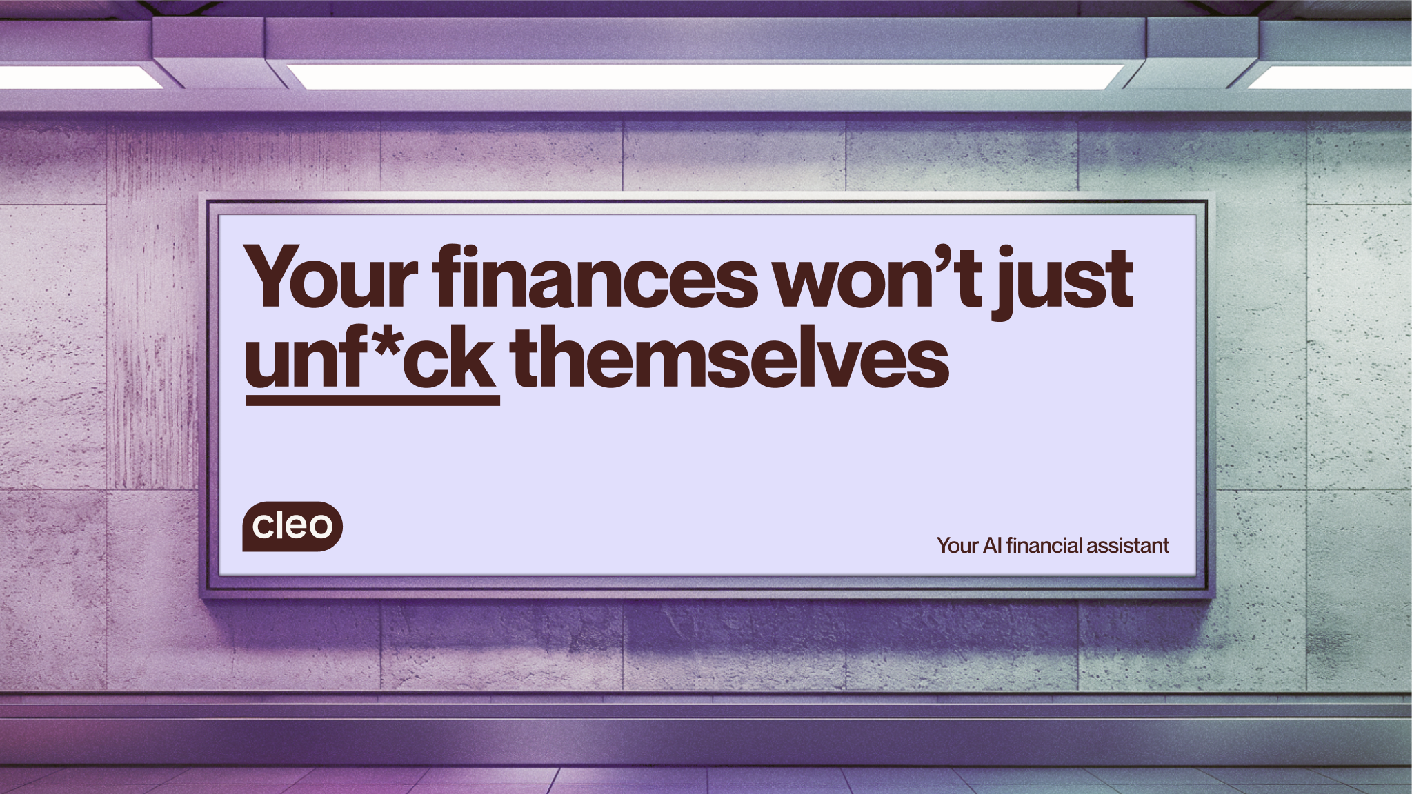
The new brand expression brings Cleo’s smart and sassy personality to the forefront.
A distinctive brown primary colour palette, gives the brand a functional, approachable, and slightly retro-future aesthetic. Supporting secondary colours and gradient “Pulse” elements subtly signify Cleo’s artificial intelligence modes, and add variety and accent to product and marketing applications.
Imagery displays a near-future world, presenting situations, objects and places that are somewhat familiar, but with a unique twist.
I helped Cleo in-house, as part of the rebrand team, to evolve and scale the brand, resulting in a robust ready-to-ship design system.
Role: Design Director
Responsibilities:
– Brand evolution
– Art direction
– Product design
– Brand implementation
Credits:
VP Design: Richard Jones
